Sprout Dental
Challenge
A child’s first visit to the dentist doesn’t have to be terrifying. But it usually is. Sprout Dental, a pediatric dental practice in Northeast Pennsylvania, wanted to build something different from the ground up: an environment so warm, so playful, and so genuinely kid-friendly that children would actually look forward to coming. That vision had to start with the brand. The name, logo, mascot, and environmental design all needed to work together to transform how families felt the moment they saw the practice or walked into it.
Solution
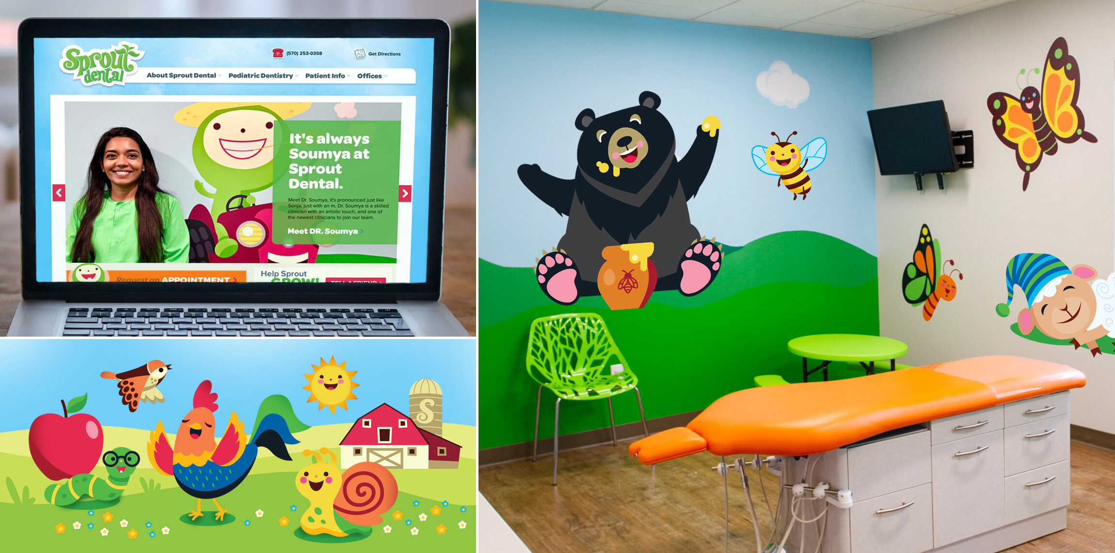
Open Haus created the Sprout Dental brand from concept through execution. We designed the logo and brought the mascot character, Sprout, to life: a friendly, inviting figure built to feel organic and approachable without leaning on clichéd dental tropes (no giant teeth, no forced smiles). From there, the relationship grew. Over the years, we’ve illustrated dozens of characters for Sprout: smiling animals, clouds, butterflies, regionally native flowers and trees, all printed as wall clings that transform exam rooms and waiting areas into immersive, imaginative spaces. As Sprout grew from one location to four, the character library grew with it.
Result
Sprout Dental built a practice identity that functions as its best marketing tool. The brand communicates to anxious kids and their parents simultaneously: to the child, it is safe and fun; to the parent, it shows they care. That’s not just good design. That’s good business. Four locations and a loyal, growing patient base are the proof.